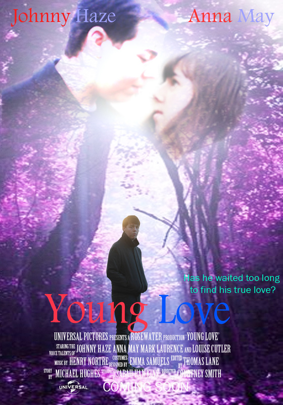
The final version of the poster.
 The poster for the ancillary task is almost complete a couple more adjustments are required then it is finished. The image of the two of them at the top could be improved by showing them in more detail.
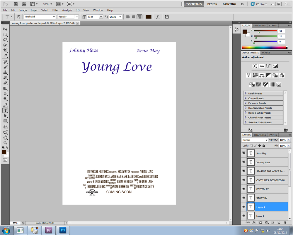 So far with the poster I have managed to get the titles complete for this I just need to include the image that will be included. The 
To make sure that the billing block is in the correct layout, I have been doing some research into the shaping, format and additional information that would need to be included in a billing block. Below I have found an example of the ideal sizing of the font in which the size of the billing block needs to be 25% of the size of the title of the poster. The font also needs to be different from that of the title, It needs to be more compact and less eligible to read, but still readable. 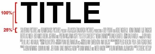 The billing block would either come in three different styles of line amounts for the block. Either three, four or nine. Depending on how much there is needed to be included in the block or even how the creators of the film want the appearance of the block to get across to the audience.
The variation of lines can also have an impact on the nature of the genre of the films and the style of the format of the font type. I am currently creating the billing block in Adobe Photoshop and I am following an example of the order of titles to occur on the poster. The names to include in this are the production company, which is currently Universal Pictures but it may change to another one. Voice talents, I have decided to include four names for this as there is no typical amount to include in the billing block and as there are two main people featured in the trailer I thought adding a couple of extra names will be appropriate to use. Followed by the music by and costumes designed. Then it will also include the screenplay writer, editors, producer and finishing of with the director. Also at the bottom of the billing board, it will include the release date of the film/ coming soon featured centered with the production company logo placed bottom far left of the poster so that it adheres to typical conventions of the billing block for films and there posters. I have spent the majority of today's lesson working on the billing block for the poster and has taken longer than expected to do so but the block is almost there. The colour of the background to the poster has to define the image in more detail to make it stand to all the other posters that are already out there to get the interest of the audience to watch the film. Most often the case is that they would have white as the background just to make it more vivid with the image. The colour of the background could also determines the genre of the film and so is important to stick to normal colours. However, on other occasions the appropriate colour to use is a more bright colour to help with the comical side to the genre.
The colours that are usually used in the posters of this genre. The influence of the colour is something that needs to be considered. In most cases the use of a white background is something that is fine to use and can help with the impact of the poster on the audience. The background for mine will probably be a pale colour to follow typical conventions of the genre. In both lines of colours there influence is enormous. By considering the positioning of the typical layouts of rom-com posters, I have decided to have the girl looking behind while having her boyfriend have his arm around her with her young love being behind turned to the side looking in the girls direction. From researching into posters, I have decided to include the billing board placed at the bottom of the page, actor names placed at the top of the poster. With probably a quote from the trailer or something referencing the trailer.  Final design above. I decided that the other two designs would have worked but I decided to go with the above. With the male walking through the woods to represent his journey he must take to get the girl and to show the pair of them together but with some awkwardness as she is seeing someone else. With looking at other posters, this does fall in line with what some look like.
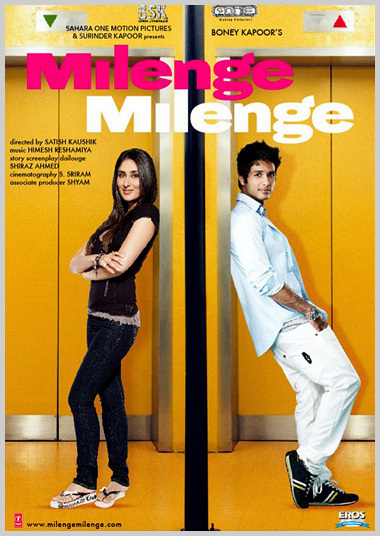
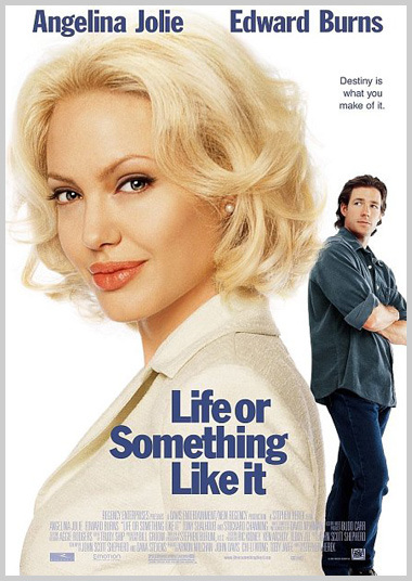
http://www.empireonline.com/features/romantic-comedy-movie-poster-cliches/p5 There is normally seven ways the characters of a romance film are positioned on a poster are:
I would like to make the poster less typical of that of usual poster revolving around romance but from the choices above the most appropriate would have to be the three faces.
(Young Love) Poster idea having the boyfriend to the girl have his arm around the girl, with her looking round and her old friend being behind the couple, standing in the distance. It would feature the couple as a mid shot and then a full image of the old friend. But this does not depict the idea of it being a young love. However, if I use the other title (When we meet?) The poster would feature the person walking past in the street. The fonts that are usually used on a romantic film poster are quite simple with it being quite a rounded font to add to the whole romantic feel to the poster. The same font is used throughout the poster with big names, phrases but not the billing board which is usually done in the same font for each film no matter what the genre is.
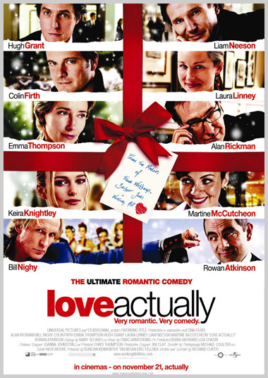
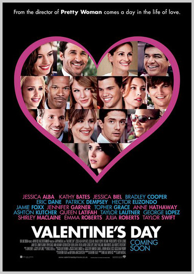
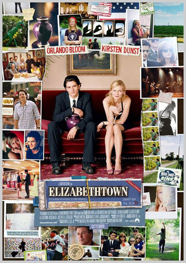
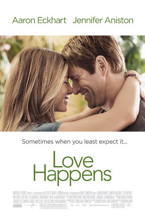
The posters featured above all use different fonts from the more simple of Love Happens to a more extreme (hand written) styled font. The font is also appropriate to the themes within the film, locations, accents to emphasis the nature of the genre. These are all suited to the genre and any could be used, it would just depend on whether the font looks right with the title of the trailer.
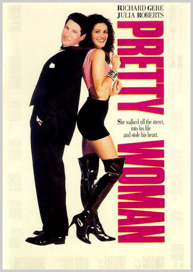
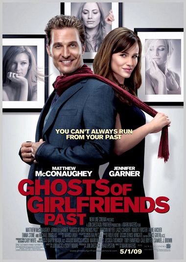
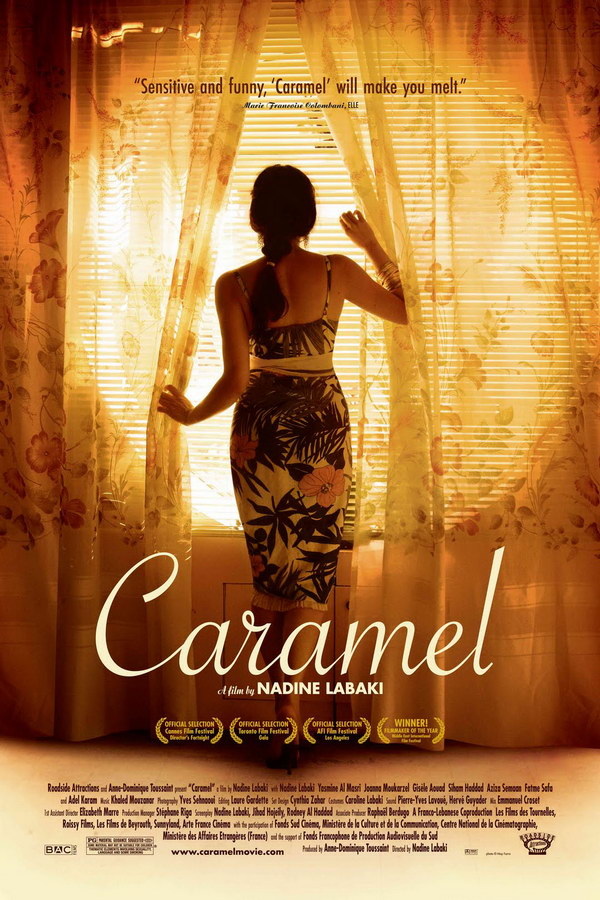
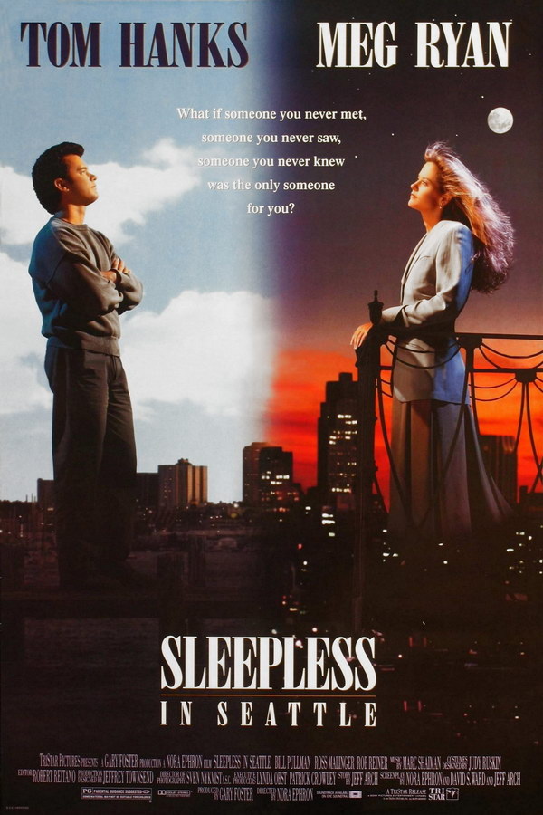
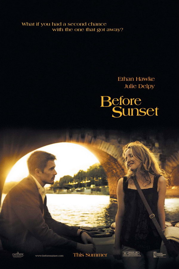
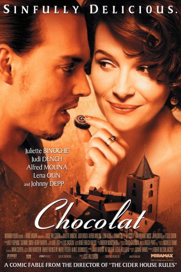
Love Happens Avenir Font Caramel is a Savoye font Sleepless in Seattle a Bodoni font Before Sunset Americana Font Chocolat Ribbon 131 font Love Happens font is a really common font to use in romantic films as it is basic, simple font that also gives the film its essence of being a romance. The rounded nature of the font is ideal as... The font used for Caramel is an unusual font that is not normally used in film/ posters as its associations are not usually commonly found in films but is ideal for the idea of this film. Chocolat font is normally used in films based in France or have a french revelation to the film where in this case the films title is actually the french term for chocolate. Hence, making the font appropriate to the film. However, in the case of my idea this would not be appropriate as there is no reference to France/ french. Typical colours for titles are white, red or blue. All the colours used usually have some sort of association with romance, and therefore makes sense to use one of these colours. Other associations that make the colour appropriate are the location in which it is set.  The Prince & Me poster, the first of four films in the franchise. Aims its target audience at females (teens+) due to the phrase, 'This Fairy Tale is About to Get Real' . The idea of it being every girls fantasy when growing up for when their prince will come for them. The pink tones throughout show the ideal stereotype for the female audience. As the females are drawn to this colour, with its symbolic nature of being associated with females. The idea of it being a romance film is apparent by the fact she is wearing this colour and the curtain drapes are of the same sort of tone. Hence re-iterating the fact that this film is being aimed at a female audience.
The image of the female 'Julia Stiles' is centralised making her of high importance to the film and that it will revolve around her and so making her the lead protagonist. The stars name at the top of the poster, typical convention for posters to follow or above the title of the film. For mine I think it would be more appropriate to be placed at the top. The title placed in the lower third of the poster above the credit block. The title is clear and directly in the audiences view. The consumer can tell straight away that this is a feminine film.
The romantic comedy posters that I have looked all seem to follow the same structure:
Examples  Conventions of film Posters
|
AuthorWrite something about yourself. No need to be fancy, just an overview. Archives
April 2015
Categories |


 RSS Feed
