 The second cover. I have finally finished this with the final finishing touches mentioned previously in another post. I will now ask people to comment on what I have produced for this ancillary and if they say about anything needing to be changed for the evaluation question. If the people ask come back with some negative feedback then I will change what was necessarily needed for this after all the feedback comes back.
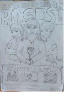
 The collectors cover, almost there with completion, all that is left for this one is the image of the final person to be placed next to the female. The flower could be adjusted slightly.
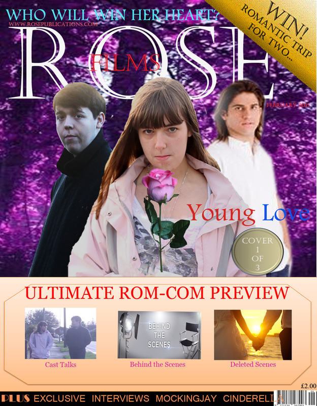
 I have decided to create two covers a collectors cover and a normal cover. This is the normal cover and it is almost complete a couple more adjustments are required. From some feedback I have got from this after printing I have found that the text is easy to read but the colour of the text across the female could be a different colour as it is not always clear to read and does not stand out as well as what it could be. I could also have something on the right hand side as it is a bit plain and could make it a bit more interesting to the eye. The rose I have used could be coloured as it is not that symbolic as to what the rose is symbolising in this instance, and so to make it more relevant to what the teaser trailer is about I could change the colour of this like I have done for the other front cover, but to make it more realistic than what the other one is currently looking like. As I have mentioned before about the font of the masthead that it could be different and seem more romantic as this is what I have made the magazine dedicated to, to appeal to my target audience of females. This should not take too much longer and so the first of the ancillaries will be complete and I can get more feedback for the evaluation question.
 I have edited the image to remove the background, increase the size of the image, and edited the colours of the rose. The rose does look a bit unrealistic so more editing will be required. I have however, included the image onto the front cover for now as something better might come along later. If a can find a way to remove this rose while keeping the image in tact then I will add another image of the rose. If this is not going to be possible then I am going to re-take the image using a different rose.  This is the second image I am using for the cover. I have again removed the background, increased the contrast and brightness, softened the edges so there is no back ground shown around the image. The image has been placed on the cover so that it is superimposed behind the image of the female. As this is how I planned it to be shown on the cover from my design. It follows it quite well and does look alright.  The collectors cover so far, I do not have that much more to do to this. I need to add a bit more text and the final image to go on the right hand side. I will need to also adjust the rose to make it look realistic. The images and text to be placed over the orange section of the cover. From my original design it is not that far off. 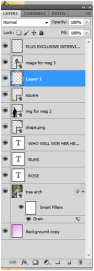 This screenshot shows what I have done so far with in the editing stages of the front cover magazine. With the added effects, the stages at which the text is at. Some of the changes I have made, might be changed later on, like the applied grain effect on the background image as it does look a bit odd and some of the text is not readable. I might change the image if it still does not look right with the rest of the magazine.  To make the rose the female is holding look more realistic I have used the spot healing brush tool to remove the drawn flower, leaving the background to how it is supposed to be and replaced with a fake rose of a more appropriately coloured rose I have taken.
http://asubtlerevelry.com/25-free-romantic-fonts
http://www.linotype.com/7903/currentmoviefonts.html I have been trying to find a better font to use for the cover of the magazine, as the one I am currently using does not look that great so I have found a few sites that have some suitable fonts to use and so I will try and find one similar on the Adobe Photoshop.  One of the images that I was initially going to use, is not actually suitable as the image will not go to the right size and still look right with the rest of the cover. It turns out I did not take enough of the picture so when I increase the size it becomes pixelated and so it does not look right.
As the magazine needs to include the trailer I am creating I have thought of calling it something that has associations with romance to get a female audience attracted to the magazine but at the same time I need it to relate to films as this is what the magazine is going to be for. 
So what I have decided is to have the title I have included in the design but also include film, within the title of roses.
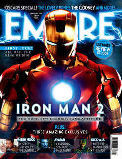
 I have finished the design for the front cover magazine. I will be going ahead with creating the cover on Monday. As of yet I have not made a start on the front cover to the magazine but I will be starting later on in the week, once I have finalised what I am going to include, images, titles. The positioning I have got some idea for. In order to get some more ideas as to what to include I have decided to purchase an Empire film magazine to get inspiration from.  Empire magazine above is the one that I purchased. It is a collectors magazine which this company normally does.
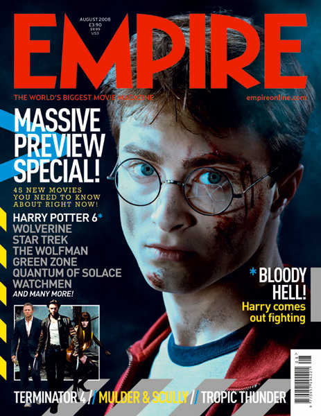
Masthead- bold, red and one of the first items that is noticeable on the cover. It stands out and the consumers are drawn to this as they are a well known company and are therefore more likely to purchase it. Image- the main image shows three people standing two behind and one in front, emphasising his importance. The image itself is quite dull and so would attract a more masculine audience. Guest editor- someone that would attract the audience as it is something that only this magazine is likely to have. Barcode- placed down the left hand side half way up, which is not a typical place for it to be placed as this is directly in the line of sight of the audience and would pay attention to this. Anchorage- lower third with the images relating to the hobbit, makes it clearer for the consumer to understand what they are on about and to also persuade them to buy the magazine. Buzz word- win- something that attracts the audience as most cases it would be something that they never have done, would like to have. Farwell to Middle Earth- relates to the main subject of the cover. Very common for magazines to do this as it gives extra information as to what it is about and that it is the last film in the trilogy for the hobbit book. Therefore making sense. 25 years- well known- and must have something going for it to continue for this long so would encourage people to want to read it.  The master-head of the magazine- Typical size for the master-head is for it to span the width of the magazine. This association is common for most magazines to follow no matter what its genre type or target audience. The name of the magazine I have chosen to use is Rose. Font style I have decided to use is Lucida Calligraphy. This font seems to appear very feminine and since the target audience for the magazine is going to be aimed at females, it seems ideal to use this font. The master-head is normally capitalised with the occasional exception, depending on the style of magazine or target audience. I have also included a space between each letter to help fill the space more. I think this also helps with attracting a female audience as this font is fairly similar to some fashion magazines so could also influence this target audience to read this magazine due to the association.
Special feature that will attract the audience- Something Free or Win- a possible poster inside or could win a trip to the location where the film was filmed like they have done in the Empire magazine I purchased. Other films that are going to be featured- The Hunger Games part 1, Cinderella (2015) and others. Each type of magazine has its own style of genre to adhere to and to attract the intended target audience. To make it appropriate for the audience.
Film Magazines The target audience to most film magazines are targeted at males, as the typical conventions of a film magazine cover is to show an image from a horror, action film rather than a romantic comedy. Since the target audience of the trailer I am creating is aimed at females, I have to make the magazine interest this gender. Therefore I will need to create a cover that would appeal to a female audience. In this case something free from a film that they would most likely watch would be the most appropriate way of getting this audiences attention.

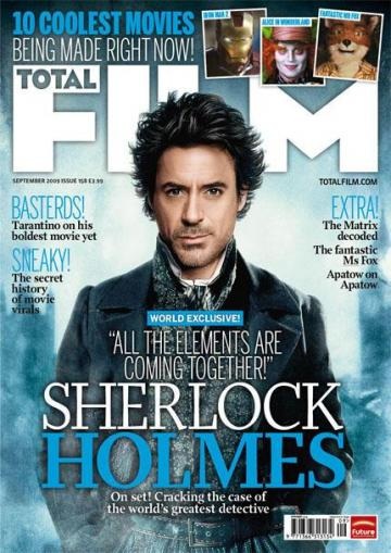
audience to read on and purchase the product. These words are also capitalised and blue establishing this as being an important word to grab audience’s attention. These are positioned either side of the main image, which it makes it more revealing and vivid to the eye as an audience is drawn to the central part of the magazine rather than top or bottom. These two are also positioned in line with each other, to make it more professional. 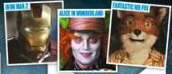 ANCHORAGE- In order to entice the audience further into reading Total Film have included an anchorage of images that show what is in store for them. With having these images featured to the right of the puff entices the audience’s attention into wanting to read about these new films that are out.  Film Title- This magazine has included the title of the film that relates to the main image on the cover, resulting in a greater impact of influence, as Sherlock Holmes are very popular books, TV shows and films and the resulting title has that impact on the audience to purchase the product. A well-known actor, character can have a huge impact on sales. The use of white and blue for the title links in with the colour scheme of the background but also the text. Making the whole magazine link together, and looking professional. The title is featured in the bottom third of the cover at a fairly big size having a greater impact due to it being larger than most things featured on the page. This gets the audience drawn to this section as it is bolder and larger and basically in the consumers face adding its significance. The smaller writing pictured on the left of the title is positioned below the title on the cover adding to the significance of the title and image. This text is smaller so is not as important as the title itself but it does provide that extra bit of detail to the audience as to what is to be expected from this. 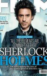 MAIN IMAGE- The main image on the cover is positioned larger than everything else indicating it is the highlight of the magazine. This image is also positioned in the centre further drawing the audience in with the character looking directly at the audience entices with the audiences gaze, providing further encouragement to purchase the product. Especially if this actor is someone that audiences could favour over others. Also his appearance is not that of an everyday person and so could draw audiences into buying with the idea of a mystery behind the person to further understand why he is like the way he is and what it is all about relating back to the title as Sherlock Holmes is someone that solves crimes but not much is really known about him. The image also superimposes with the magazine masterhead. Typical convention of magazine covers. There is only one character shown and makes the audience think that he must be have a critical part in the film, also influencing the audience’s opinion of the film and magazine. 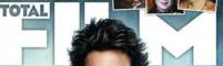 MASTERHEAD- The masterhead of the magazine is positioned in the top third of the magazine cover. In which the audience is unable to see all of the title with the fact of having the main image overlapping this. This is ideal especially if the customer is a regular and this is something that would probably occur in each issue is ideal as it is something that the audience can recognise easily. With having the image in front of the masterhead is a good thing as it allows the image to take up a greater amount of space without anything looking out of place with them all intersecting. The font is simple with is being cornered but also in a white colour for film and blue for total. This stands out and easily catches the attention of the audience into knowing what magazine this is.  PRICING- The price of the magazine is placed with the date of the issue its issue number. This is positioned below the masterhead and is comparatively small and so the consumers’ attention is not drawn to this. This is an important part to the consumer as to whether or not to purchase the product, so having it small lessens the attention and are less likely to take notice of the price as they would be too distracted as to everything else on the cover. Issue number is important as in this case it is issue number 158 which means it is long running and must be a popular magazine for it to have gone on for this long. This could also encourage the consumers to buy as it must have something going for it to go on for as long as what it has done so could get a vaster audience than before.  Website- The website is also featured on the cover on the other side of the main image. This is also small, which means it is not an important part to the magazine. The added website is of some convenience as the audience would be able to find out more information of the company with other items they have written about, but also allows the audience to subscribe to the product if they have not done so already.  Barcode-
The barcode is positioned in the bottom right hand corner so it is still identifiable as to where to scan the product for the checkout operator but it does not draw attention of the consumer. This is quite small in comparison to everything else on the page signifying that this is not that important in relation. Its positioning is something that is typical of most magazines keeping this out of sight of the audience. I have previously analysed magazine covers before for my GCSE Media Studies and found that following a list of definitions helped working out what each of the aspects were and why they were used. Therefore I have decided to find a list of terms used in front covers to help with my understanding of analysing Front Cover Magazines.
This issue of Total Film dates back to 2012.
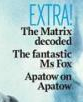
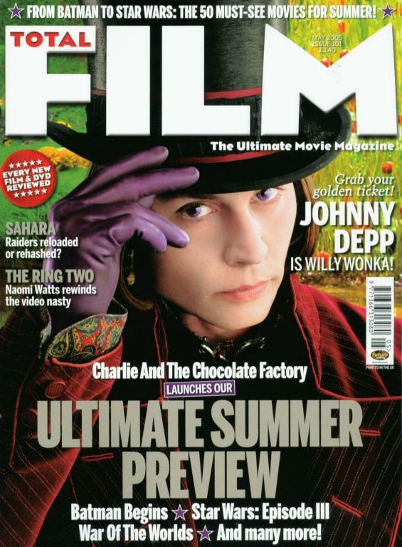
I am trying to find magazines that would normally feature rom-com's/ romantic films. I have come across a few that has some slight associations to the genre but not much.
There is no specific magazine that includes an image from a romantic comedy due to the target audience of film magazines. Occasionally film magazines do include exclusive lists including romantic comedies but no big feature apart from like I will need to include in the front cover are: An image from the trailer. The name of the magazine. Other films mentioned either in text form or images. The design will be added later on in another post. Therefore I have designed the covers to the requirements mentioned above.  This is just one of the 25 limited edition collectors cover as an example. The collector edition covers are more simpler than that of normal magazine front covers. However, this appeals more to audience as it is a limited edition and makes them want it more. A collectors cover is something to consider, as it is more of encouragement to purchase the product. It is something different and makes the audience want it more with having the limited makes it more worth while as it would not be around for long and there would be only so many people that would be able to get hold of one putting them into a class of their own. However, a collectors cover is not something that is usually done with a rom-com. The 25 covers also sell the film to the audience as each one would allow the audience to discover more about the film and enhancing their need to watch the film. 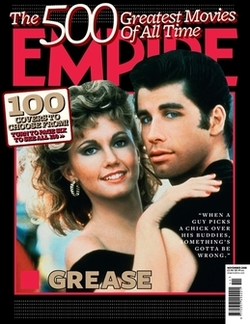 In the same as the collectors covers for The X-Men, Empire magazine has done the same sort of thing with the idea of having the top 500 movies of all time with a different cover for that issue. Which is not necessarily the same genre.
Empire magazine seems to have a tendency to do this with there magazine covers every so often. It is a good idea as it is promoting not just the films but also the magazine as well. This also helps this publication to get more sales from doing this as it is encouraging the audience to buy them with the X-Men covers being limited gets the audience to want them more just so they can say they have them but it would also be a first come first serve basis so would want to get in there quick. Genre that the trailer is based on is romantic comedy. Therefore I will be looking at magazine covers that revolve around this genre and what features they would have in specific to the type of magazine and their features.
Examples of front cover magazines.
Each of the examples above contain each of the following.
|
Archives
April 2015
AuthorWrite something about yourself. No need to be fancy, just an overview. Categories |
 RSS Feed
