The fonts that are usually used on a romantic film poster are quite simple with it being quite a rounded font to add to the whole romantic feel to the poster. The same font is used throughout the poster with big names, phrases but not the billing board which is usually done in the same font for each film no matter what the genre is.
 |  |  |  |  |
The posters featured above all use different fonts from the more simple of Love Happens to a more extreme (hand written) styled font. The font is also appropriate to the themes within the film, locations, accents to emphasis the nature of the genre. These are all suited to the genre and any could be used, it would just depend on whether the font looks right with the title of the trailer.
Love Happens Avenir Font
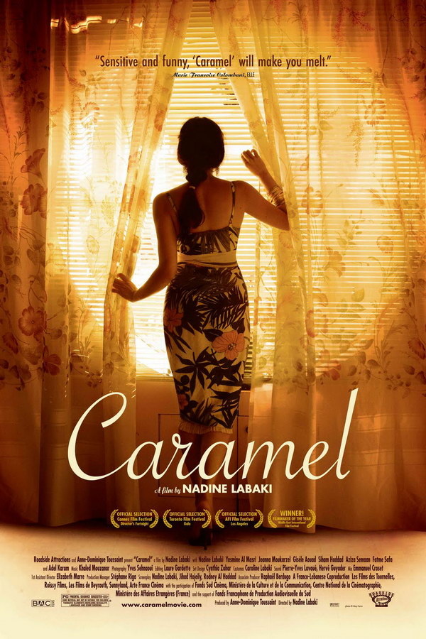
Caramel is a Savoye font
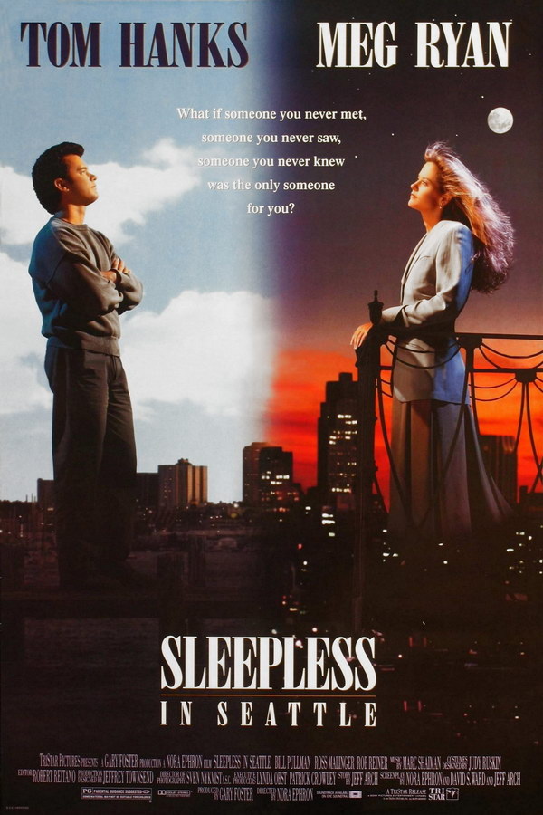
Sleepless in Seattle a Bodoni font
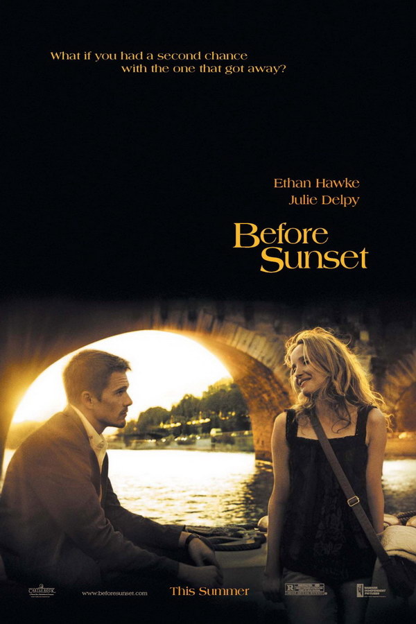
Before Sunset Americana Font
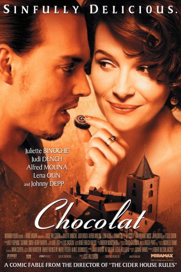
Chocolat Ribbon 131 font
Love Happens font is a really common font to use in romantic films as it is basic, simple font that also gives the film its essence of being a romance. The rounded nature of the font is ideal as...
The font used for Caramel is an unusual font that is not normally used in film/ posters as its associations are not usually commonly found in films but is ideal for the idea of this film.
Chocolat font is normally used in films based in France or have a french revelation to the film where in this case the films title is actually the french term for chocolate. Hence, making the font appropriate to the film. However, in the case of my idea this would not be appropriate as there is no reference to France/ french.
Typical colours for titles are white, red or blue. All the colours used usually have some sort of association with romance, and therefore makes sense to use one of these colours. Other associations that make the colour appropriate are the location in which it is set.
Love Happens Avenir Font
Caramel is a Savoye font
Sleepless in Seattle a Bodoni font
Before Sunset Americana Font
Chocolat Ribbon 131 font
Love Happens font is a really common font to use in romantic films as it is basic, simple font that also gives the film its essence of being a romance. The rounded nature of the font is ideal as...
The font used for Caramel is an unusual font that is not normally used in film/ posters as its associations are not usually commonly found in films but is ideal for the idea of this film.
Chocolat font is normally used in films based in France or have a french revelation to the film where in this case the films title is actually the french term for chocolate. Hence, making the font appropriate to the film. However, in the case of my idea this would not be appropriate as there is no reference to France/ french.
Typical colours for titles are white, red or blue. All the colours used usually have some sort of association with romance, and therefore makes sense to use one of these colours. Other associations that make the colour appropriate are the location in which it is set.
 RSS Feed
