
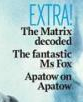
  | There are also additional puffs (cover lines) that are featured on the page. The additional information that this cover provides entices the audience that bit further into reading. The words ‘sneaky’ and ‘extra’ influences the audience as it is providing a greater impact towards the |
audience to read on and purchase the product. These words are also capitalised and blue establishing this as being an important word to grab audience’s attention. These are positioned either side of the main image, which it makes it more revealing and vivid to the eye as an audience is drawn to the central part of the magazine rather than top or bottom. These two are also positioned in line with each other, to make it more professional.
ANCHORAGE-
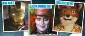
In order to entice the audience further into reading Total Film have included an anchorage of images that show what is in store for them. With having these images featured to the right of the puff entices the audience’s attention into wanting to read about these new films that are out.
In order to entice the audience further into reading Total Film have included an anchorage of images that show what is in store for them. With having these images featured to the right of the puff entices the audience’s attention into wanting to read about these new films that are out.

Film Title-
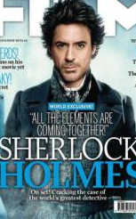
This magazine has included the title of the film that relates to the main image on the cover, resulting in a greater impact of influence, as Sherlock Holmes are very popular books, TV shows and films and the resulting title has that impact on the audience to purchase the product. A well-known actor, character can have a huge impact on sales. The use of white and blue for the title links in with the colour scheme of the background but also the text. Making the whole magazine link together, and looking professional. The title is featured in the bottom third of the cover at a fairly big size having a greater impact due to it being larger than most things featured on the page. This gets the audience drawn to this section as it is bolder and larger and basically in the consumers face adding its significance. The smaller writing pictured on the left of the title is positioned below the title on the cover adding to the significance of the title and image. This text is smaller so is not as important as the title itself but it does provide that extra bit of detail to the audience as to what is to be expected from this.
This magazine has included the title of the film that relates to the main image on the cover, resulting in a greater impact of influence, as Sherlock Holmes are very popular books, TV shows and films and the resulting title has that impact on the audience to purchase the product. A well-known actor, character can have a huge impact on sales. The use of white and blue for the title links in with the colour scheme of the background but also the text. Making the whole magazine link together, and looking professional. The title is featured in the bottom third of the cover at a fairly big size having a greater impact due to it being larger than most things featured on the page. This gets the audience drawn to this section as it is bolder and larger and basically in the consumers face adding its significance. The smaller writing pictured on the left of the title is positioned below the title on the cover adding to the significance of the title and image. This text is smaller so is not as important as the title itself but it does provide that extra bit of detail to the audience as to what is to be expected from this.
MAIN IMAGE-
The main image on the cover is positioned larger than everything else indicating it is the highlight of the magazine. This image is also positioned in the centre further drawing the audience in with the character looking directly at the audience entices with the audiences gaze, providing further encouragement to purchase the product. Especially if this actor is someone that audiences could favour over others. Also his appearance is not that of an everyday person and so could draw audiences into buying with the idea of a mystery behind the person to further understand why he is like the way he is and what it is all about relating back to the title as Sherlock Holmes is someone that solves crimes but not much is really known about him. The image also superimposes with the magazine masterhead. Typical convention of magazine covers. There is only one character shown and makes the audience think that he must be have a critical part in the film, also influencing the audience’s opinion of the film and magazine.
The main image on the cover is positioned larger than everything else indicating it is the highlight of the magazine. This image is also positioned in the centre further drawing the audience in with the character looking directly at the audience entices with the audiences gaze, providing further encouragement to purchase the product. Especially if this actor is someone that audiences could favour over others. Also his appearance is not that of an everyday person and so could draw audiences into buying with the idea of a mystery behind the person to further understand why he is like the way he is and what it is all about relating back to the title as Sherlock Holmes is someone that solves crimes but not much is really known about him. The image also superimposes with the magazine masterhead. Typical convention of magazine covers. There is only one character shown and makes the audience think that he must be have a critical part in the film, also influencing the audience’s opinion of the film and magazine.

MASTERHEAD-
The masterhead of the magazine is positioned in the top third of the magazine cover. In which the audience is unable to see all of the title with the fact of having the main image overlapping this. This is ideal especially if the customer is a regular and this is something that would probably occur in each issue is ideal as it is something that the audience can recognise easily. With having the image in front of the masterhead is a good thing as it allows the image to take up a greater amount of space without anything looking out of place with them all intersecting. The font is simple with is being cornered but also in a white colour for film and blue for total. This stands out and easily catches the attention of the audience into knowing what magazine this is.
The masterhead of the magazine is positioned in the top third of the magazine cover. In which the audience is unable to see all of the title with the fact of having the main image overlapping this. This is ideal especially if the customer is a regular and this is something that would probably occur in each issue is ideal as it is something that the audience can recognise easily. With having the image in front of the masterhead is a good thing as it allows the image to take up a greater amount of space without anything looking out of place with them all intersecting. The font is simple with is being cornered but also in a white colour for film and blue for total. This stands out and easily catches the attention of the audience into knowing what magazine this is.
PRICING-
The price of the magazine is placed with the date of the issue its issue number. This is positioned below the masterhead and is comparatively small and so the consumers’ attention is not drawn to this. This is an important part to the consumer as to whether or not to purchase the product, so having it small lessens the attention and are less likely to take notice of the price as they would be too distracted as to everything else on the cover. Issue number is important as in this case it is issue number 158 which means it is long running and must be a popular magazine for it to have gone on for this long. This could also encourage the consumers to buy as it must have something going for it to go on for as long as what it has done so could get a vaster audience than before.
The price of the magazine is placed with the date of the issue its issue number. This is positioned below the masterhead and is comparatively small and so the consumers’ attention is not drawn to this. This is an important part to the consumer as to whether or not to purchase the product, so having it small lessens the attention and are less likely to take notice of the price as they would be too distracted as to everything else on the cover. Issue number is important as in this case it is issue number 158 which means it is long running and must be a popular magazine for it to have gone on for this long. This could also encourage the consumers to buy as it must have something going for it to go on for as long as what it has done so could get a vaster audience than before.

Website-
The website is also featured on the cover on the other side of the main image. This is also small, which means it is not an important part to the magazine. The added website is of some convenience as the audience would be able to find out more information of the company with other items they have written about, but also allows the audience to subscribe to the product if they have not done so already.
The website is also featured on the cover on the other side of the main image. This is also small, which means it is not an important part to the magazine. The added website is of some convenience as the audience would be able to find out more information of the company with other items they have written about, but also allows the audience to subscribe to the product if they have not done so already.

Barcode-
The barcode is positioned in the bottom right hand corner so it is still identifiable as to where to scan the product for the checkout operator but it does not draw attention of the consumer. This is quite small in comparison to everything else on the page signifying that this is not that important in relation. Its positioning is something that is typical of most magazines keeping this out of sight of the audience.
The barcode is positioned in the bottom right hand corner so it is still identifiable as to where to scan the product for the checkout operator but it does not draw attention of the consumer. This is quite small in comparison to everything else on the page signifying that this is not that important in relation. Its positioning is something that is typical of most magazines keeping this out of sight of the audience.

 RSS Feed
